When you create a website, you set a specific goal for it. For a corporate blog, it's branding; for a referral site, it's increasing registrations through an affiliate link; for an online store, it's increasing sales. In any case, every website faces a specific goal. Let's say your site is already quite popular, with some sales or registrations.

You start thinking about increasing them. One of the elements of marketing for increasing conversion (the ratio of users who complete the desired action to the total number of users) is A/B testing.
What is A/B testing?
A/B testing is a marketing technique where users are shown equal amounts of different pages on your website to measure conversion. This can involve both large-scale changes (such as a complete page redesign) and small changes (such as changing a button color). It's worth mentioning that this is a completely white hat SEO technique used by thousands of companies worldwide (like Amazon, for example).
Practice
Our team is currently working on an English-language startup, a service that allows you to create commercial proposals online. Once we achieved decent traffic, we began running various tests to increase conversion. Our first test involved replacing one start page with another. Below is the first version and a similar version.
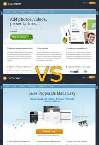
The test failed! Conversion decreased by approximately 20%. This is most likely due to the fact that users need to see information at the top of the page, which we didn't have in the test.
Next came work on button colors, placement, and so on. We gained truly tremendous experience, which we are happy to share (for example, conversion increased when using green, orange, and blue buttons, and increased when placing registration buttons at the top and bottom, rather than in the middle).
Increase conversion
The A/B test is still ongoing, but we were able to increase conversion by 1.3 times thanks to minor tweaks. Further analysis of the statistics revealed that a large percentage of users were dropping out after landing on the registration form.
The next major test was replacing the registration form. Here are the old and new forms. As the results showed, changing the form increased conversion by another 60%. While minor details are still being refined, it's clear that many people are put off by forms longer than 5 lines.
Doubling sales
As you can see, A/B testing helped double sales, even though traffic remained the same. From a technical perspective, it's also quite simple: create the same page on your website using these services:
- Google Website Optimizer,
- Optimizely,
- Unbounce,
- or KissMetrics.
You change some elements, and you're given Java code to paste into two pages. Now users will see both pages in equal proportions.
Have a nice day and high sales!